
For this project, I knew I wanted to dive into my interest in User Interface design through re-designing an application that I was familiar with. I ended up on Venmo as I use it on a weekly basis, so I was comfortable with the functions and goals of the app. There were two main parts surrounding this Venmo re-design: creating all the UI assets in Illustraitor then animating it all in a commercial showcasing the apps functions using After Effects.
When I began to work on these different commercials I broke down the process into 3 main parts:
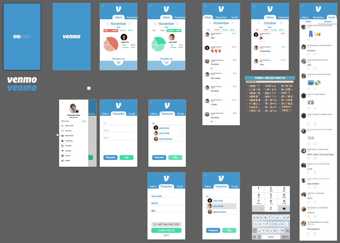
To breakdown the UI design I knew that I wanted it to still feel like Venmo. Rather an completely doing something new, I opted for what users could expect on a Venmo update- a fresh look while keeping the same general feeling and navigation. I constrained my assets to the Venmo styles guide to make sure it had the exact look and feel I was after.
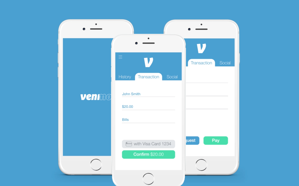
After making each piece of the different screen content, filling in mock information and testing the look behind a phone overlay, it was time to move into UI animation.
Quick and responsive were my two major goals when animating each screen. I wanted it to feel like someone was actually using the app by making natural looking scrolling to go along with the peppy buttons. The user should be able to follow what is happening on the screen and easily see what they tapped.
The different commercial styles combined all the individual processes together. Initially, the project entailed creating one commercial that was cut to different lengths; however, I wanted each version to push its own narrative as it showcased varying amounts of features of the product. The 30 second version was all about speed and ease of sending a transaction with a campy music vibe surrounding it. The 45 second drove home the cutting-edge qualities of the app alongside a dynamic 3D rendering of the phone synced to the music. Finally, the 1minute showcased all the functions Venmo could provide while pushing home the mantra “Quick. Easy. Secure.”
This entire process pushed me through the entire front-end design process. I created the wireframes into full-fledged mockups then animated each button and screen as I would do to create a detailed prototype for a development team. All of this took a lot of time, but I enjoyed practicing laying out a digit app. With all the different screens and intricate assets, it’s really a bigger task than one would think.
Then moving into animating everything I got to play with it all in After Effects which is always a joy. Even shifting a button slightly or color shifting a button on click brings life and responsiveness to the space. This was actually my first-time diving into Cinema 4D during the 45 second version and that space took a bit of getting used to but ended up working out well. Initially I planned on extending the 45 second version to include a few more features, but it didn’t feel right just dragging it out. Instead I started from the ground up again to build out the minute-long ad and I’m glad I put in all that extra work. It actually ended up being a lot less tiring than I expected because I was having such a good time putting something together that I knew I would be proud of, and I developed a new appreciate for vapor wave music after all the late nights in After Effects! :D